Workout Meals New Branding Campaign Photoshoot
The client:
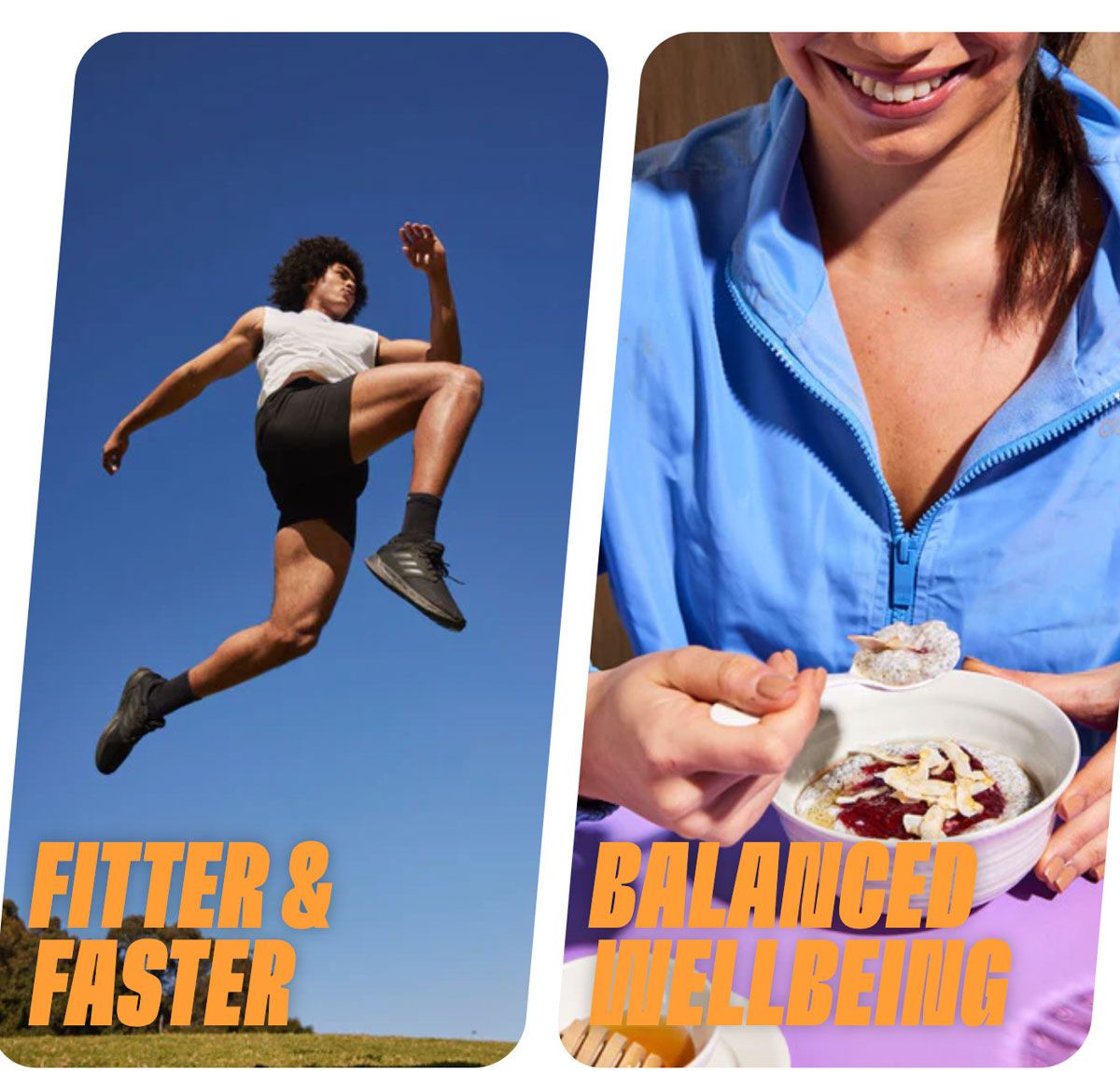
Workout Meals produces ready-made meals specifically for pre and post gym and workouts. The meals are ready-to-go healthy alternatives to home cooking and delivered to your door. Meals are designed by expert sports dieticians and feature high protein and high fibre options to suit weight loss, fitness and muscle gain as well as individual dietary requirements.
The brief:
Workout Meals engaged a cutting-edge creative studio Design by Twist to re brand the company’s identity. The new look logos, packaging and colour palette was a strategic approach to the target market. My job was to interpret the designer’s mood boards and concepts and translate them to fit the styling of the ready-made food and athletic look talent.
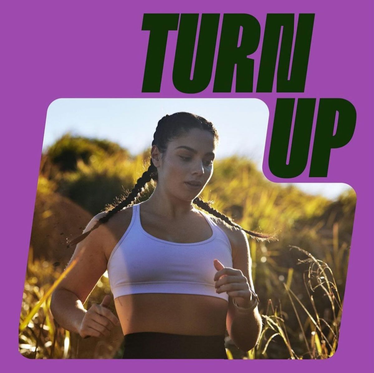
THE LOOK:
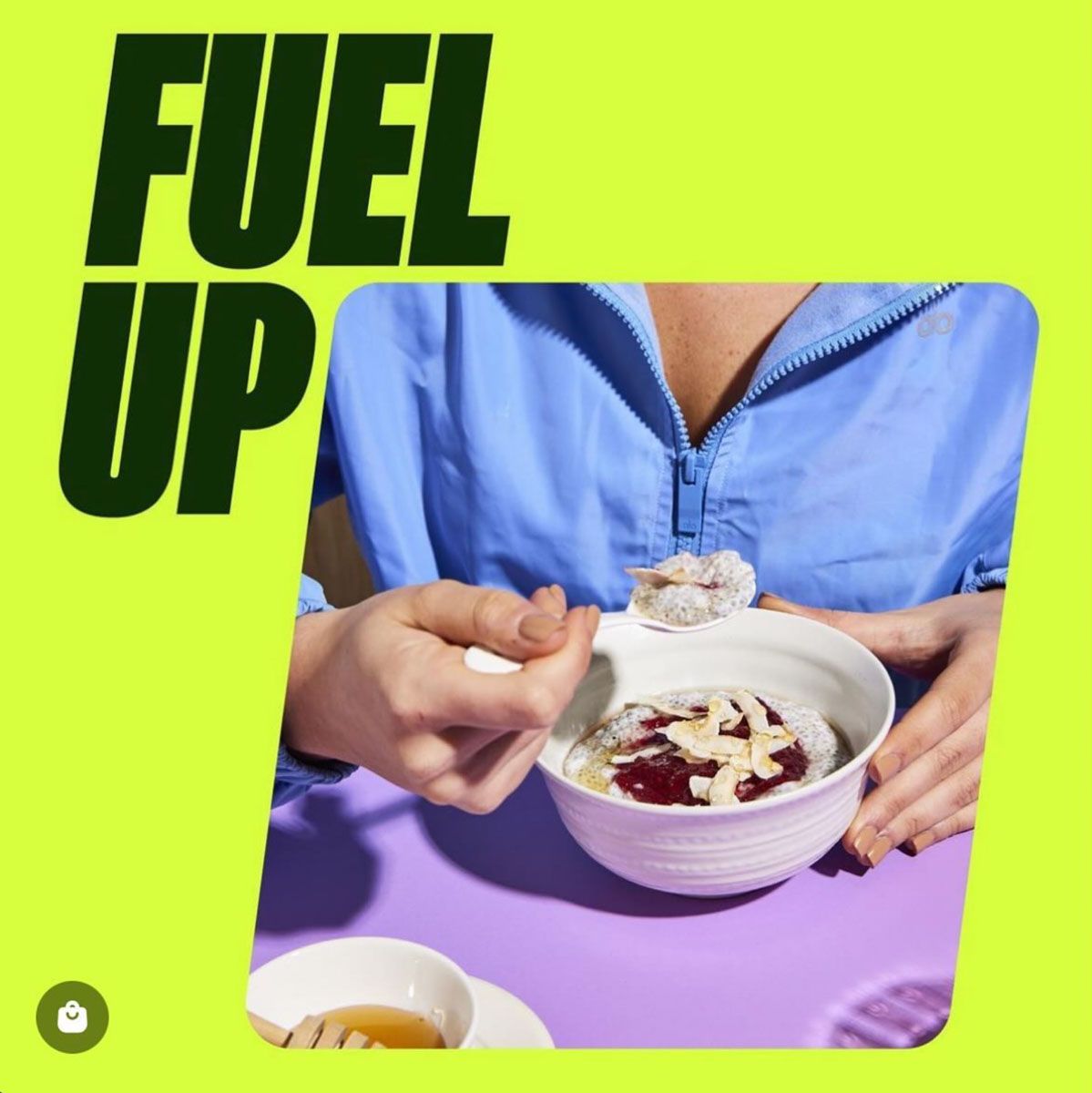
A cutting-edge graphic style with strong shadows was the concept. The food was to be shot on a clean colour background that could signal the different verticals. The photographer was to use bright lights and strong shadows, to create impactful and appetizing food images. The colour palette was designed to allow many colour combinations ranged from vibrant and energetic to more pastel and calm, depending on when the client wants to target athletic motion or natural ingredients.
THE JOBS/SCOPE OF WORK:
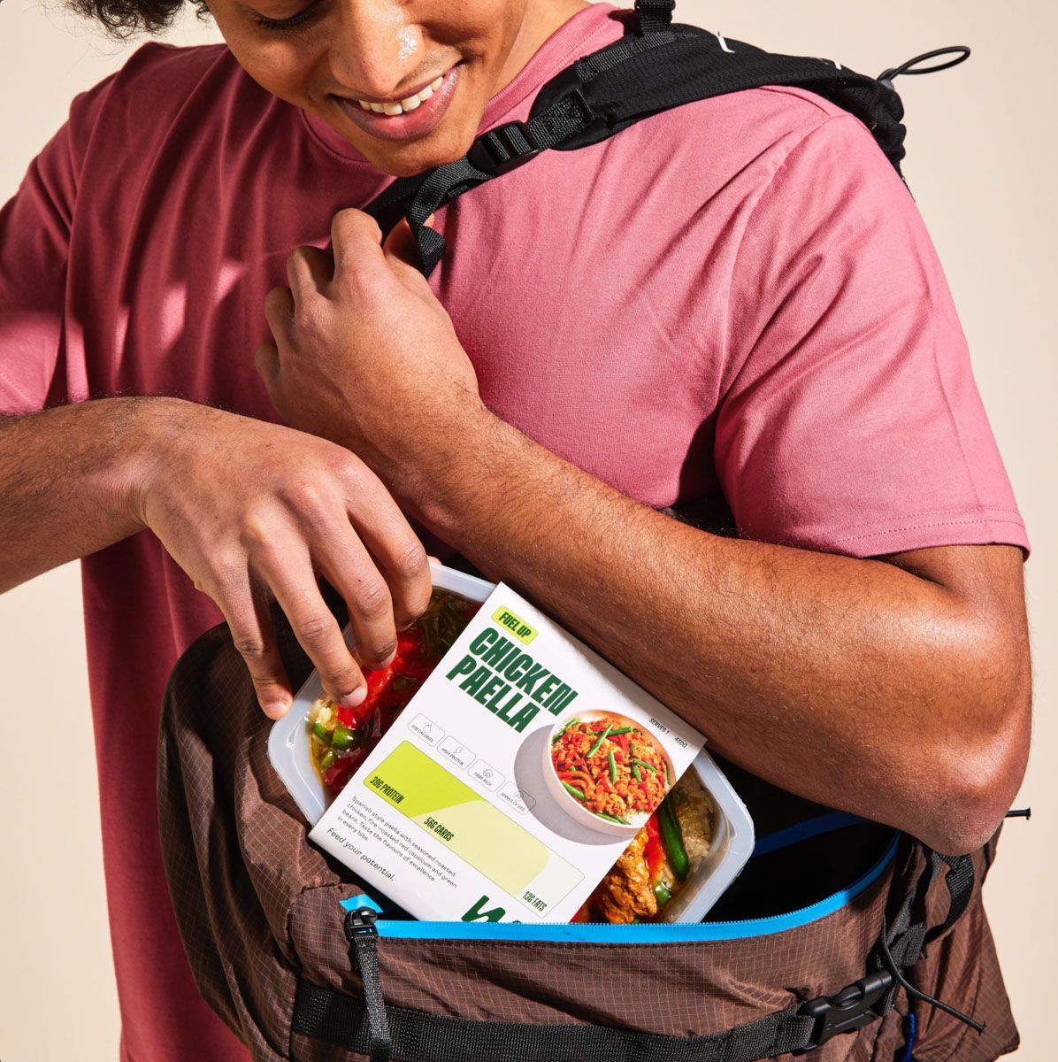
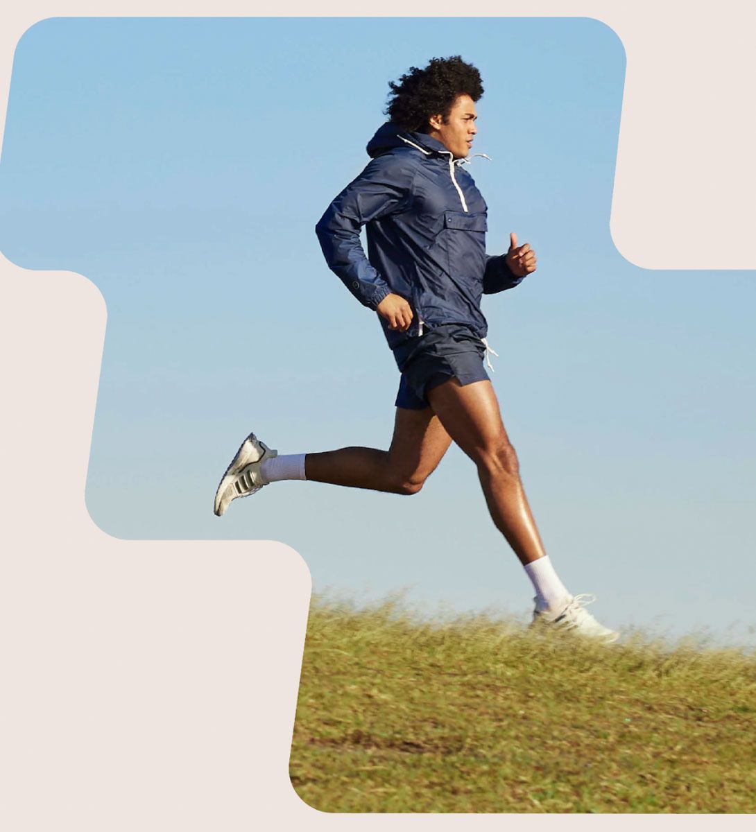
My brief was to use the new colour palette of kale, peanut and lime as the primary colours and then introduce the secondary colour palette as highlights to prop, style and plate the readymade food + source and style the wardrobe for the talent for both stills and video,
For the food images, the meal was to be the focus of the shot, it needed to be styled to look like you wanted to dive in and take a bite, highlighting individual ingredients and meal components.
Plates, bowls and vessels were chosen for the individual meals that first and foremost showcased the food, made the meal look substantial, fresh and delicious and they needed to be neutral in nature in line with the mood board provided.
The job ran over 3 days in the studio and 1 day on location with one of the studio days and the location day to include male and female talent.
THE BUDGET:
Advertising day rate for propping, returns and styling days was established + props hire and purchase, couriers budget based on the client’s requirements and the number of shots per day.
THE OUTCOME:
Colour played a key role in the new brand identity. It was positive and vibrant, bright without being too overwhelming. The colour palette was designed to allow many colour combinations ranged from vibrant and energetic to more pastel and calm. This was reflected in the props and wardrobe to compliment the new brand design.
I worked with the photographer, designers and client on the shoot days to achieve the highest impact images to launch the new look campaign and for ongoing use in advertising, billboards, social media, packaging and on their website.
CLIENT FEEDBACK:
‘You’re the best! So lucky to have you. Thank you’
Sarah Borenstein
Chief Marketing Officer, Workout Meals & Iku Wholefood